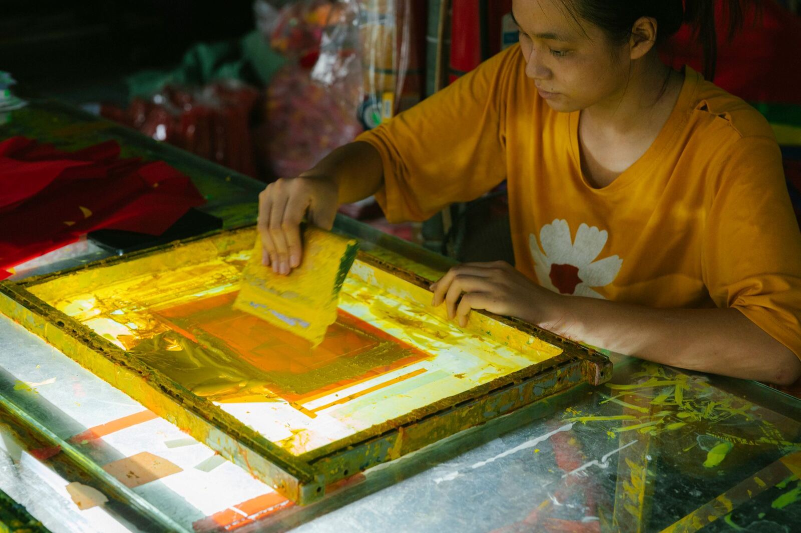
Halftones are how one solid ink produces the appearance of a gradient. Dots vary in size, ink does not vary in colour. Get the frequency wrong for your mesh and the fine end of every gradient simply disappears.
The relationship
A halftone dot must be supported by threads in the mesh. Too fine a dot on too coarse a mesh falls through the gaps or fails to hold at all.
The usual working rule: mesh count around 4 to 5 times the LPI.
| LPI | Suggested mesh | Use |
|---|---|---|
| 35 | 140 to 180 | Coarse, forgiving, visible dot |
| 45 | 180 to 230 | Reliable general-purpose halftone |
| 55 | 230 to 280 | Detailed work, clean setups |
| 65 | 280 to 305 | Fine gradients, tight control needed |
| 75+ | 305+ | Specialist, unforgiving |
That is a starting point, not gospel. Emulsion thickness, exposure accuracy, film quality, squeegee and ink all shift it. The point is to start in the right neighbourhood and then test.
Test with a step wedge
Print a strip that steps from 5 percent to 100 percent tone in small increments, then look at the actual screen and the actual print.
- Dots missing at the light end on the print but present on the screen: ink or squeegee problem, or mesh too coarse to release cleanly.
- Dots missing on the screen but present on the film: exposure. Usually over-exposed, sometimes under-exposed with washout losing them.
- Dots missing on the film: separation settings, or the output device cannot hold them.
That single test tells you your real usable tonal range. Most shops find they hold from around 8 percent to 92 percent, which means separations should be built to that range rather than to 0 to 100.
Use elliptical dots
Round dots all touch their neighbours at nearly the same tonal value, which creates a visible jump in the midtones. Elliptical dots join along one axis first, so the transition is gradual. There is no cost to switching and the midtones improve immediately.
Angles matter for process work
For single-colour halftones, any sensible angle works; 22.5 or 45 degrees are common. For four-colour process or simulated process, the angles must be offset between colours or you get moiré, a visible interference pattern. Standard offsets exist for a reason; deviate from them only deliberately.
Mesh choice is not only about halftones
Higher mesh means a thinner ink deposit, which means less opacity. On a dark garment you need the base white opaque and the halftone layers fine, which is exactly why the underbase runs through lower mesh than the colours above it. See printing on dark garments.
Write down what works
Once you find that 50 LPI at 230 mesh with your exposure unit and emulsion reliably holds 8 to 92 percent, that is a shop standard. Put it on the wall. Separations should be built to it every time, rather than rediscovered per job.
Log the combination that worked, against the job
The most expensive thing in this whole subject is rediscovery. A shop finds that a particular design at 50 LPI on 230 mesh with a 90 second exposure runs cleanly, and then loses that knowledge the moment the person who found it takes a day off.
The fix is a run record attached to the order rather than a note in a drawer:
| Field | Example |
|---|---|
| LPI and dot shape | 50 LPI, elliptical, 22.5 degrees |
| Mesh and tension | 230, 22 N/cm |
| Emulsion and EOM | Dual cure, 12% over mesh |
| Exposure | 95 s, unit at 1.2 m |
| Squeegee and durometer | 70/90/70, 15 degrees |
| Off contact | 1.5 mm |
| Held tonal range | 8 to 92 percent |
With that on the order, a reorder eighteen months later runs the same way. Without it, the reorder is a fresh test at your own expense, which is one of the quiet reasons reorders can be less profitable than they should be.
The cost of a badly matched pairing
Think of a mismatch as a tax on every garment. Highlights blow out, so someone reprints. Midtones plug, so the job gets re-separated and re-shot. Each of those events consumes screens, emulsion, film and press time, and none of them appear on the quote.
A practical way to see the size of the problem: record time against the job from separation through to first good print. Once that is measured rather than estimated, the job costing report will show which jobs consumed setup hours out of all proportion to their value, and that list is almost always dominated by high-LPI work on the wrong mesh. Either raise the price of that work or standardise the pairing so it stops costing you.
Standardise on three combinations, not thirty
Most shops need three:
- Detail on light garments. Higher mesh, moderate LPI, no underbase. Where fine halftones actually pay off.
- Opacity on dark garments. Coarser mesh for the white, finer for the colours above it, conservative LPI. See printing on dark garments.
- Spot colour, no halftones. Coarse mesh, thick deposit, fast run. The bulk of most shops' work and the one where LPI is irrelevant.
Writing those three down as shop standards, with the exposure and tension that go with each, removes most of the day-to-day argument. New work gets slotted into a standard, and only genuinely unusual jobs get a test.
Printer's Friend stores separations and film output against the order and keeps the ink and screen notes with the job, so a reorder runs at the same settings rather than being re-derived. Definitions for LPI, mesh count, halftone and moiré are in the glossary.